Updated: Apr 28, 2025
Author: Tony Waldegrave
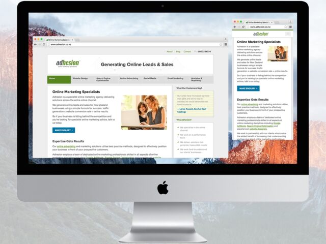
It’s no longer a question of if your website should be responsive—mobile traffic now makes up over half of all web visits, and users expect a seamless experience on every device. Google’s push for accessibility and mobile usability means responsive design is now the gold standard for web development.
Responsive design means your website automatically adjusts its layout, images, and navigation to look and function great on any device—whether it’s a phone, tablet, laptop, or desktop computer. You have a single set of content and code that adapts to any screen size, saving time on updates and ensuring a consistent experience for everyone.
Google’s recommendations have become the benchmark for responsive web design. Here are the essentials:
Your text, images, and layout should be easy to read and interact with at any screen resolution or size. Avoid tiny fonts or overcrowded content.
Maintain only one set of content and code. The same HTML is delivered to every device, with CSS controlling how things display depending on the screen size.
Visitors should never have to scroll sideways to see your content. If a horizontal scrollbar appears at any window size, your layout needs attention.
Buttons, navigation links, and forms should be large enough to tap easily on touchscreen devices, with enough space between interactive elements to prevent accidental clicks.
Ensure that images and videos scale correctly and don’t slow down page load speeds on mobile connections. Use modern formats and responsive image tags.
Improved SEO: Google gives ranking priority to websites that are mobile-friendly and provide a great user experience.
Higher Conversions: A seamless experience for all users encourages more enquiries, purchases, and sign-ups.
Future-Proof: One responsive website adapts automatically to new devices, saving you time and money.
At Adhesion, we’ve helped clients across New Zealand create and upgrade websites that look great and perform well on every screen. If you want advice, an audit, or a responsive redesign, contact us. We’re here to help your business grow by staying ahead of the latest web standards.
"Our team at Logotech has worked with Adhesion for several years now, and the experience has been exceptional. We deal mainly with Thomas Hill (SEO Manager) and Jennifer Christie (Senior Account Manager), both of whom have been absolutely invaluable. They have successfully steered Logotech in the right direction, providing expert guidance every step of the way. Thomas and Jennifer have been incredibly helpful with refreshing and improving our website to better capture our audience. They also helped us build our brand through a much stronger social media marketing strategy. The enhancements and improvements they implemented are really paying off now. We are seeing a noticeable increase in high-quality inquiries coming through our website. We highly recommend Adhesion for their expertise, dedication, and proven results!"
★★★★★ Tony Carson June 2026
"From start to completion of upgrading our digital platform Adhesion were superb. Throughout , all communications with Adhesion left us feeling confident in their ability to deliver the project and in the end we were very satisfied with the process and outcome. Highest Recommendation ."
★★★★★ Dean Bell June 2026
"I highly recommend Jennifer, our Account Manager at Adhesion. She has bought us through years of business in a difficult industry. Highly recommended"
★★★★★ Chemwash Cleaning Auckland June 2026
"Adhesion made transforming my outdated website to a Shopify website easy. They are positive, professional and have excellent communication skills. As a free lance designer specializing in art and illustration, I was daunted by the tech aspect of it all but Bobby and Vivienne were enthusiastic and understanding about my ideas for an ecommerce site. They were very patient with my many stupid questions and changes along the way. I am extremely happy with the result and look forward to working with them for years to come."
★★★★★ Tanya Wolfkamp June 2026
"We've recently partnered with Adhesion to manage our Google Ads campaigns, and we're already seeing positive results. Traffic to our targeted service pages has increased, and we're starting to see stronger engagement from the areas and services we're focusing on. The team have been professional, responsive, and easy to work with throughout the setup and optimisation process. They took the time to understand our business, our service areas, and our goals, and have provided clear communication and reporting along the way."
★★★★★ Support Ruahine property works June 2026
"Having worked with Jen and the Adhesion team for the past four years, I can confidently recommend them for their deep expertise in digital advertising, particularly in the ever-evolving Google Ads space. The level of care and attention we receive as a client is exceptional. Their thoughtful, detail-driven approach aligns closely with how we value craftsmanship in our own work. From fortnightly check-ins to adjusting our needs of different monthly reporting and ongoing communication, I have complete confidence that our campaigns and budget are being carefully managed and continually refined by Jen and the wider Adhesion team."
★★★★★ Kalos Chan June 2026
"We’ve been working with Adhesion for many years now and they’ve been great to work with. Super friendly, easy to deal with, responsive, and always willing to work closely with us to understand our business needs. Big shout-out to Jen, Thomas, and Mackenzie for all the support over the years!"
★★★★★ Laksitha Siriwardena May 2026
"Our company Planet Earth Travel were so pleased to have worked with Adhesion over many years to do our Google Ads. Their team did a run through of our website to identify areas of improvement before even building ad campaigns. Excellent added value that we never even thought about! We worked with Jenny & Thomas, and they did a fantastic job. So easy to work with and very approachable with great advice. We highly recommend Adhesion!"
★★★★★ Peter Carpenter May 2026
"I must have the best personal client manager in the world. Peter is always on the case checking my Google Adverts. My Google adverts had been paused due to concerns that I existed. Peter discovered this and pulled out all the stops to ensure that I existed again. Google Adverts are back up and I'm getting an 11% conversion rate."
★★★★★ Brian Campbell April 2026
"Great communication and friendly helpful team."
★★★★★ Carolynne McFarland May 2026
"We moved to Adhesion from another agency and we have been nothing but impressed with their exceptional service. With Jen and Ricki-lee's support we now have clarity on our strategy and the performance of our campaigns has significantly improved. Jen is a truly dedicated account manager who goes above and beyond for her clients. Highly recommend Bobby, Jen, Ricki-lee, Thomas and the team at Adhesion"
★★★★★ Benedict Stewart January 2026
"Adhesion have consistently provided great service for the past 9 years that I have worked with them. The team is friendly, helpful and knowledgeable. Thank you to Jen, Peter and Courteney for all of your hard work and guidance."
★★★★★ Hayley Blase December 2025
"Working with Jennifer from Adhesion has been a real asset to our business. She’s proactive, reliable, and always focused on helping us achieve better results. I’ve come to trust her judgment and appreciate the way she partners with us to navigate a competitive environment. Having someone like Jennifer on our side gives us confidence that we’re making the right moves to grow our business."
★★★★★ Malcolm Reid December 2025
"Adhesion started managing the Google Add campaigns and profile for The Fantail House stores 3 months ago. Their results have been outstanding for us and the upshot is a good increase in sales volume. They have the perfect characteristics of youth and intelligence that comes with experience to make them very effective players in this competitive space."
★★★★★ Lisa Caughey November 2025
"We have reached out to Adhesion to do an audit on our Social Media ads after the ads created by another agency didn't bring the results we were hoping to see. They provided great well substantiated feedback very quickly and we decided to make the switch. The team worked really hard and have set up our new ads in an incredibly short time frame as we needed to get going to achieve our launch objectives. Within a day of running the new ads we have seen a huge increase in traffic and conversion to our website. Especially Peter Volkov has been incredibly responsive and really great to deal with. We are now expanding our ads and also adding Google Ads to the scope. We are looking forward to seeing more great results. Thanks team!"
★★★★★ Jana Greissner da Silva October 2025
"I couldn't recommend these guys enough. Between Jen, Rueben, Courteney and Alex they've taken our business from complete startup with no Google footprint to a huge amount of great quality converting traffic. They're always on hand no matter how big or small the request is. I've learnt heaps about Google and how best to use it within the business. Thanks Team!"
★★★★★ Alyce Boyle October 2025
"Peter has been fantastic to work with, proactive, clear in his communication, and genuinely focused on getting the best results. Highly recommend his support"
★★★★★ Toby Appleton September 2025
"We have been working with Ricki-lee from Adhesion with our online marketing for a while now and I can tell you she is full of great ideas for getting people interested and contacting our business. In fact, Ricki-lee is now a very important part of our team, and I can't recommend her, and the team behind her, highly enough."
★★★★★ Kevin Downing June 2025
"I've really enjoyed working with Jen and Ryan from Adhesion! They've been very responsive and knowledgeable and have gone out of their way to help when I've needed campaigns setup in short notice. Highly recommend the team at Adhesion!!!"
★★★★★ Karthik Hariharan May 2025
"Very efficient in getting a result."
★★★★★ Oksana Fediuk May 2025
"We've been with Adhesion for a couple of years now, and they've consistently provided prompt and reliable support. Thanks a lot team for your expert advice and exceptional service throughout this time. Our Google Ads have been performing much better in recent months, thanks to your hard work and dedication. Our recent experiences with Ricki-Lee and Jennifer have been fantastic—it’s such a relief to know that we can be in contact anytime we need. It truly feels personal. Thanks again, ladies! 😊"
★★★★★ Sandeep Nagpal May 2025
"I have been with Adhesion for a couple of years and I am very confident that they are working in my best interest. Peter Volkov communicates well with me and picks up concepts about my business quickly. I am doing well in my business as a result of Adhesion's commitment to their client. I previously had an unfortunate experience of working with a large company who promised the world, charged the earth and delivered nothing of value. The difference now is outstanding."
★★★★★ Karen @ Child Behaviour Service April 2025
"Peter has done a great job running my google ads - highly recommended."
★★★★★ Alex Patten April 2025
"Working with Adhesion I have found them to not only be very helpful but also reasonable and fair on pricing"
★★★★★ Rita Patel-Kumar April 2025
"After years of watching clients get burned by faceless agencies and one-person marketers who vanish overnight, finding Phillippa at Adhesion felt like a revelation."
★★★★★ Alex Mann April 2025
"Ricki-Lee was an amazing account manager. Always pro-active and looking for improvements to my campaign. Would highly recommend!"
★★★★★ Chris April 2025
"A huge thank you to Adhesion, and especially to Ricki-lee, for being an absolute rockstar with my ad campaigns! From the very start, she’s been incredibly responsive—always quick to answer any questions and on top of everything to make sure my ads are running smoothly. I love how creative she is, the way she puts the ads together is just perfect! She continuously monitors and optimizes them, making sure they perform at their best. If you're looking for someone who truly cares about your success and delivers amazing results, Ricki-lee is the one!"
★★★★★ Picnique Queenstown February 2025
"I've had the pleasure of working with the Adhesion team for years, and they have consistently provided professional and valuable services. The entire team is fantastic to work with, and Courteney, in particular, stands out for her attentiveness and responsiveness. Her keen attention to detail and dedication to delivering top-quality service have greatly benefited our projects. I highly recommend Adhesion for their expertise, reliability, and outstanding customer support."
★★★★★ Frank Krieger January 2025
"Adhesion, Jen & Court have taken our online marketing strategy from strength to strength over the many years we have been using them for Gordon Harris. Courteney is an absolute star! Their knowledge is deep and broad, keeping us up to date with the latest opportunities to make our campaigns work better. Highly recommend."
★★★★★ Laura Budd January 2025
"I worked with Reuben @ Adhesion through a previous business which was sold and a new start up business of mine. Very prompt at setting up new campaigns, sorting issues and implementing changes. Nothing was ever an issue and all campaigns delivered acceptable results. Would recommend to any small business owner looking for a more personal agency."
★★★★★ Kyle Simpson December 2024
"We love working with the team at Adhesion, they did an outstanding job with our website—The Lodge at 58 North. Not only did they understand our unique needs as small business owners, but they also perfectly blended creativity and functionality, crafting a site that captures the spirit of our lodge while providing an intuitive, user-friendly experience for our guests. The team's attention to detail and expertise brought our vision to life, showcasing our lodge's unique charm and commitment to authentic experiences.The whole team is professional, highly responsive, and genuinely invested in our success—making us feel supported every step of the way. The result is a beautiful, functional website that reflects our lodge and makes it easy for visitors to explore, book, and get excited about their stay.We highly recommend the Adhesion Team—it's a joy to work with them!"
★★★★★ Administrative Assistant October 2024
"I would like to say that Reuben Nel from Adhesion has been of excellent assistance with our google words campaign. He has excellent knowledge and insight and could communicate that in an easy and understandable way. I would certainly recommend Reuben to you"
★★★★★ Leave Calendar October 2024
"We've been working with Courteney from Adhesion for a year now and it's one of the best business decisions we've made. The growth in online sales, as well as in-store referrals, is testament to Courteney’s expertise. Her communication is superb, she offers practical advice, and nothing is a problem. Highly recommend!"
★★★★★ Velo Ronny's Bicycle Store September 2024
"I have been using adhesion for about 2 months now and my ads and revenue has increased significantly, not too mention there customer service is 5 star. I will carry on working with this company and Rueben Thank you for great work. I highly recommend after using many different agency’s over the last 2 years in NZ and AU. Thanks Again James Roberts SPORTZONE"
★★★★★ James August 2024
