Updated: Apr 02, 2025
Author: Tony Waldegrave
Optimising your website’s conversion funnel to increase sales, downloads or subscriptions can be a daunting task to start. There are typically two approaches to Conversion Rate Optimisation (CRO).
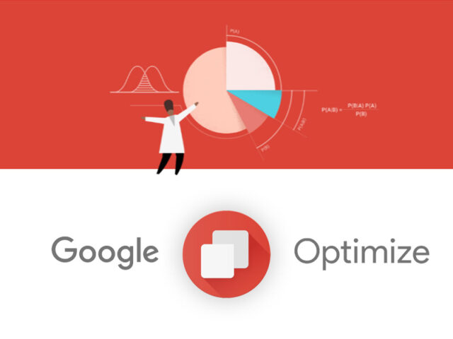
The first can be achieved with Google Optimise, a tool which A/B tests different versions of your website (e.g. Anything from differently coloured buttons to completely redesigned webpages). Google Optimise then provides thorough statistical analysis about the differing performance of your website. This is a sure-fire method used by many large businesses to increase conversions, however it usually requires many months of high-traffic activity (think of it as a long-term CRO strategy).
The second approach to CRO is a little more risky and requires you to know what you’re doing, otherwise you could end up investing in new website designs that performs worse than your original. The goal of this blog article is to minimise that risk by passing on some of our CRO expertise to you. So, the first question you need to ask yourself is: “Does my website need minor adjustments, or does my website need a facelift?”
If you chose the former, you’d benefit from checking out this article: Usability Testing For Websites — A How To Guide.
If you chose the latter, the first hurdle your website will face is being re-indexed by Google’s crawling bots (software that periodically examines your website so that Google knows what it’s delivering people on search results pages). If Google senses a large change to your website, instead of immediately dropping the positions of your ‘unproven’ website, it can give it a temporary ‘boost’. This lets Google test how your new website design performs at different positions on search results pages. If users engage positively in your new website (which they should if you follow this guide), Google will rank your website higher. Alright, let’s go.
You've probably heard about the 5 second rule. Your website should achieve the following within 5 seconds of a visitor landing on it:
Completing the above list, won’t necessarily make visitors give you their money or share your content, but it may keep them around long enough for them to do so.
Achieving all the above will be wasteful without the proper use of white/negative space. But white space isn’t about having a huge image in the background and oversized headers. For an example of strategic white space, just check out the website of any successful company (e.g. www.google.co.nz or www.apple.com/nz).
People scroll a lot more in today’s mobile-first world, so don’t be afraid to spread things out vertically. The first thing to consider is ‘above the fold’ content. That is, when someone loads your website, everything they can see without scrolling is called above the fold. There are two main rules here: Most navigation must be doable without scrolling; Your above the fold line should not include white space (there should be some content cut off at the fold so that people are cued to scroll).
Many websites make the mistake of having a small font size and/or a small line height. Your paragraph text should be at least 16px to 19px (or about 1em to 1.2em) in size. And don’t be afraid to set your line-height to 1.5 spacing. You can also set your letter-spacing around 0.2px to 0.3px (or about 0.01em to 0.02em) to spread out characters, making words easier to read. Readability is also affected by paragraph width. Paragraphs become especially hard to read on desktops when the width of the paragraph is greater than the height of the screen (about 60%).
Designing white space so that your website is optically balanced is a skill which can be self-taught over time. If you are in need of design expertise, you can always contact the Adhesion team.
This one is much more straight forward. If you don’t already have your business listed on Google My Business, do that today (not tomorrow). You’ll want to put as much accurate information on your listing as possible, and add high quality logo, profile and cover photos (e.g. your logo will appear in a circular element on Google, so make it a 1080px by 1080px square if you can). After that, you should start soliciting reviews from customers you’ve pleased. Aim for at least one review every month. To increase buyer confidence, you should add a section near the bottom of every webpage in your conversion funnel (e.g. the Adhesion website is a good example). Don’t just put any 5-star review on your website. A 4-star review which allays some fear of purchase is much more trustworthy than a generic 5 star review. And don’t stop there. For each review, include a small image of stars, and a small image of the person/business to increase authenticity.
Some people prefer to leave reviews and comments on Facebook, so make sure you have a Facebook page for your business (even if you don’t really use it).
If you’re not a large business, it’s likely that you’re in an industry with competition that doesn’t disclose prices, budget estimates or hidden costs. Leverage this. You probably won’t want to, but put your prices out there for everyone to see, and ensure your website visitors know if your competitors don’t do the same. It’s not slander. It’s healthy competition which promotes transparency.
Adhesion used to not have pricing available online. Then, prices were available via brochure downloads, but required you to enter your email. Now, we’re putting prices out in the open. So, when our potential customers are comparing marketing agencies, they immediately see Adhesion as more trustworthy.
Your website likely has many more pages than are in your menu. Any page that isn’t your homepage, a product/service page or your contact page should arguably not be in your main menu list. Other pages like About Us, Locations, Terms and Conditions, and Blog should go in a secondary menu or in your footer to prevent people leaving your sales funnel (e.g. again, the Adhesion website is a good example).
Mobile navigation is tricky. Many websites focus too much on minimalistic design and hide navigation in a hidden hamburger menu. If somebody finds your homepage on their mobile and your menu isn’t immediately available, this introduces one more click they have to make to find where they want to go. On the other hand, webpages featuring a product or enquiry form should have their menu closed on mobile, as this is further down your sales funnel. Unfortunately, there isn’t any consensus on the best practice for mobile menu design (yet). Keep an eye out as this might change when mobile browsers adapt to larger, full-screen phones like the iPhone X. For example, I would like to see a mobile menu placed at the bottom of the screen where it’s easily reachable, but tapping the bottom of an iPhone’s browser currently toggles a hidden ‘options bar’ to slide up (instead of allowing users to click things at the bottom of their screen). That begs the question: Have you tested your footer on an iPhone recently?
Quality photography one of the most underrated aspects of small-to-medium business websites. Your customers will pigeon hole your products and services within seconds, and you can leverage that with HD images that conveys trustworthiness and respect. It’s worth investing some time in getting good photos and video since you can use them in many other places like online advertising and social media. You don’t even have to pay for a photographer if you or a colleague has a new-ish smartphone, and access to some photo editing software like Adobe Photoshop or Affinity Photo.
So how do you know what size to use? A rule of thumb is to go to your website, right click on an existing photo, click “Inspect” and then hover over the image element or look in the bottom righthand corner of the popup to see its size in pixels (It’s okay if you’re confused, just ask your web developer to show you). Whatever the size is, you’re going to want to open your photo editing software, and create a new file with the size doubled (e.g. 400px by 300px becomes 800px by 600px) and the resolution set to 72 (a.k.a. PPI or pixel density). Put simply, we’re doubling the size now so that browsers will squish the images into a space half its size, causing its resolution to double and look crisp.
Once you’ve saved your resized image, you’re going to want to compress it so its file size decreases and they take less time to load on your website. The best tool to use in 2018 is ImageOptim (and it’s free to download). Only Mac devices can utilise this tool, but there are decent Windows Alternatives for ImageOptim out there. Before optimising your images with ImageOptim, you’ll want to go to ‘Preferences’ and enable Guetzli. If you want the best-looking images, go to ‘Preferences’, then ‘Quality’ and make sure the ‘Enable lossy minification’ is unchecked. If you care about your website’s load speed (you should because it’s good for Search Engine Optimisation), then ‘Enable lossy minification’ and set the quality bars to 80%.
That’s it. You can now optimise your images and upload them to your website. All you have to worry about is Choosing Product Photos to Increase Conversion Rates. Speaking of product photos, remember to add thumbnails of recommended and related products near the bottom of each product page. You can even offer discounts for bundles of related products (see Amazon’s “Buy these 3 related products and get 10% off”).
Understandably, small and new businesses often don’t have the resources to invest in a professional website that is fine-tuned for SEO and hosted on a quality server. Unfortunately, this is one of the worst bottlenecks for growing a business online. There's a plethora of research articles which show that Websites which take longer than 1 to 2 seconds to load suffer significant drops in conversion rate. It is absolutely worth getting your web developer to spend time reading these articles to improve your site’s speed, and investing in a website host with the smallest response time possible.
Got shipping costs? Time to get rid of them. Credit card fees? Get rid of them too. Online and administration fees? Bye bye. All hidden costs must go. Think of a hidden cost as anything that causes an increase from a product’s quoted price, to the amount a person pays.
Hidden costs hurt your brand’s trust, and they tend to appear right before a user makes their final purchase decision (and often when they’re comparing competitive offerings). From your customers’ perspective, they are paying for you product or service, and that’s it. For example, if you need to pay to ship a product to a customer, that really isn’t their problem (they don’t care that you’re in another city or country because they’re online). Same goes for credit card transaction fees. People expect to be able to pay by credit card. It’s no longer a premium ‘feature’ you can charge extra for. So what should you do?
Well, let’s say it costs $10 to ship a product to a customer. Instead of charging your customer an extra shipping fee, quietly increase your product’s price to compensate. This actually has two advantages. Firstly, when a user is at the final stage in making a purchase decision, they will likely be comparing shopping carts across multiple websites. If yours doesn’t have shipping costs, that’s one more reason to choose you instead of a competitor. You might be thinking, “But if my relatively expensive product costs the same as my competitor’s cheaper product plus shipping, then I don’t think there’s much point.” This brings us to the second advantage: By increasing your products’ prices, they will are perceived as having higher quality.
So, in short, if you have multiple expenses for a single purchase, try quietly bundle all the expenses into one price. Keep it simple.
Live customer support is awesome for helping on-the-fence customers, but if you have a chat box that pops up, follows people or covers any content, Google will see that and penalise your ranking on Search results pages. Why? Because it doesn’t make for a good user experience. If a customer wants support, make sure your menu and footer make it easy for people to navigate to your contact page. Your contact page is the perfect place for a live chat, as well as a link to your facebook page (more people are starting to prefer the private chat rooms they’re used to on Facebook). Just be careful not to distract people from completing an enquiry form.
Regarding conversion rate, a live chat is not a replacement for a good Frequently Asked Questions page. If you’re customer support experts don’t have the authority to really help customers with specific requests or complicated products, then they’ll likely waste your customers’ time instead of offering a true solution.
Adhesion's team of online marketing specialists work with all kinds of NZ businesses to improve their website performance. If you have any website questions, feel free to get in touch.
"Our team at Logotech has worked with Adhesion for several years now, and the experience has been exceptional. We deal mainly with Thomas Hill (SEO Manager) and Jennifer Christie (Senior Account Manager), both of whom have been absolutely invaluable. They have successfully steered Logotech in the right direction, providing expert guidance every step of the way. Thomas and Jennifer have been incredibly helpful with refreshing and improving our website to better capture our audience. They also helped us build our brand through a much stronger social media marketing strategy. The enhancements and improvements they implemented are really paying off now. We are seeing a noticeable increase in high-quality inquiries coming through our website. We highly recommend Adhesion for their expertise, dedication, and proven results!"
★★★★★ Tony Carson June 2026
"From start to completion of upgrading our digital platform Adhesion were superb. Throughout , all communications with Adhesion left us feeling confident in their ability to deliver the project and in the end we were very satisfied with the process and outcome. Highest Recommendation ."
★★★★★ Dean Bell June 2026
"I highly recommend Jennifer, our Account Manager at Adhesion. She has bought us through years of business in a difficult industry. Highly recommended"
★★★★★ Chemwash Cleaning Auckland June 2026
"Adhesion made transforming my outdated website to a Shopify website easy. They are positive, professional and have excellent communication skills. As a free lance designer specializing in art and illustration, I was daunted by the tech aspect of it all but Bobby and Vivienne were enthusiastic and understanding about my ideas for an ecommerce site. They were very patient with my many stupid questions and changes along the way. I am extremely happy with the result and look forward to working with them for years to come."
★★★★★ Tanya Wolfkamp June 2026
"We've recently partnered with Adhesion to manage our Google Ads campaigns, and we're already seeing positive results. Traffic to our targeted service pages has increased, and we're starting to see stronger engagement from the areas and services we're focusing on. The team have been professional, responsive, and easy to work with throughout the setup and optimisation process. They took the time to understand our business, our service areas, and our goals, and have provided clear communication and reporting along the way."
★★★★★ Support Ruahine property works June 2026
"Having worked with Jen and the Adhesion team for the past four years, I can confidently recommend them for their deep expertise in digital advertising, particularly in the ever-evolving Google Ads space. The level of care and attention we receive as a client is exceptional. Their thoughtful, detail-driven approach aligns closely with how we value craftsmanship in our own work. From fortnightly check-ins to adjusting our needs of different monthly reporting and ongoing communication, I have complete confidence that our campaigns and budget are being carefully managed and continually refined by Jen and the wider Adhesion team."
★★★★★ Kalos Chan June 2026
"We’ve been working with Adhesion for many years now and they’ve been great to work with. Super friendly, easy to deal with, responsive, and always willing to work closely with us to understand our business needs. Big shout-out to Jen, Thomas, and Mackenzie for all the support over the years!"
★★★★★ Laksitha Siriwardena May 2026
"Our company Planet Earth Travel were so pleased to have worked with Adhesion over many years to do our Google Ads. Their team did a run through of our website to identify areas of improvement before even building ad campaigns. Excellent added value that we never even thought about! We worked with Jenny & Thomas, and they did a fantastic job. So easy to work with and very approachable with great advice. We highly recommend Adhesion!"
★★★★★ Peter Carpenter May 2026
"I must have the best personal client manager in the world. Peter is always on the case checking my Google Adverts. My Google adverts had been paused due to concerns that I existed. Peter discovered this and pulled out all the stops to ensure that I existed again. Google Adverts are back up and I'm getting an 11% conversion rate."
★★★★★ Brian Campbell April 2026
"Great communication and friendly helpful team."
★★★★★ Carolynne McFarland May 2026
"We moved to Adhesion from another agency and we have been nothing but impressed with their exceptional service. With Jen and Ricki-lee's support we now have clarity on our strategy and the performance of our campaigns has significantly improved. Jen is a truly dedicated account manager who goes above and beyond for her clients. Highly recommend Bobby, Jen, Ricki-lee, Thomas and the team at Adhesion"
★★★★★ Benedict Stewart January 2026
"Adhesion have consistently provided great service for the past 9 years that I have worked with them. The team is friendly, helpful and knowledgeable. Thank you to Jen, Peter and Courteney for all of your hard work and guidance."
★★★★★ Hayley Blase December 2025
"Working with Jennifer from Adhesion has been a real asset to our business. She’s proactive, reliable, and always focused on helping us achieve better results. I’ve come to trust her judgment and appreciate the way she partners with us to navigate a competitive environment. Having someone like Jennifer on our side gives us confidence that we’re making the right moves to grow our business."
★★★★★ Malcolm Reid December 2025
"Adhesion started managing the Google Add campaigns and profile for The Fantail House stores 3 months ago. Their results have been outstanding for us and the upshot is a good increase in sales volume. They have the perfect characteristics of youth and intelligence that comes with experience to make them very effective players in this competitive space."
★★★★★ Lisa Caughey November 2025
"We have reached out to Adhesion to do an audit on our Social Media ads after the ads created by another agency didn't bring the results we were hoping to see. They provided great well substantiated feedback very quickly and we decided to make the switch. The team worked really hard and have set up our new ads in an incredibly short time frame as we needed to get going to achieve our launch objectives. Within a day of running the new ads we have seen a huge increase in traffic and conversion to our website. Especially Peter Volkov has been incredibly responsive and really great to deal with. We are now expanding our ads and also adding Google Ads to the scope. We are looking forward to seeing more great results. Thanks team!"
★★★★★ Jana Greissner da Silva October 2025
"I couldn't recommend these guys enough. Between Jen, Rueben, Courteney and Alex they've taken our business from complete startup with no Google footprint to a huge amount of great quality converting traffic. They're always on hand no matter how big or small the request is. I've learnt heaps about Google and how best to use it within the business. Thanks Team!"
★★★★★ Alyce Boyle October 2025
"Peter has been fantastic to work with, proactive, clear in his communication, and genuinely focused on getting the best results. Highly recommend his support"
★★★★★ Toby Appleton September 2025
"We have been working with Ricki-lee from Adhesion with our online marketing for a while now and I can tell you she is full of great ideas for getting people interested and contacting our business. In fact, Ricki-lee is now a very important part of our team, and I can't recommend her, and the team behind her, highly enough."
★★★★★ Kevin Downing June 2025
"I've really enjoyed working with Jen and Ryan from Adhesion! They've been very responsive and knowledgeable and have gone out of their way to help when I've needed campaigns setup in short notice. Highly recommend the team at Adhesion!!!"
★★★★★ Karthik Hariharan May 2025
"Very efficient in getting a result."
★★★★★ Oksana Fediuk May 2025
"We've been with Adhesion for a couple of years now, and they've consistently provided prompt and reliable support. Thanks a lot team for your expert advice and exceptional service throughout this time. Our Google Ads have been performing much better in recent months, thanks to your hard work and dedication. Our recent experiences with Ricki-Lee and Jennifer have been fantastic—it’s such a relief to know that we can be in contact anytime we need. It truly feels personal. Thanks again, ladies! 😊"
★★★★★ Sandeep Nagpal May 2025
"I have been with Adhesion for a couple of years and I am very confident that they are working in my best interest. Peter Volkov communicates well with me and picks up concepts about my business quickly. I am doing well in my business as a result of Adhesion's commitment to their client. I previously had an unfortunate experience of working with a large company who promised the world, charged the earth and delivered nothing of value. The difference now is outstanding."
★★★★★ Karen @ Child Behaviour Service April 2025
"Peter has done a great job running my google ads - highly recommended."
★★★★★ Alex Patten April 2025
"Working with Adhesion I have found them to not only be very helpful but also reasonable and fair on pricing"
★★★★★ Rita Patel-Kumar April 2025
"After years of watching clients get burned by faceless agencies and one-person marketers who vanish overnight, finding Phillippa at Adhesion felt like a revelation."
★★★★★ Alex Mann April 2025
"Ricki-Lee was an amazing account manager. Always pro-active and looking for improvements to my campaign. Would highly recommend!"
★★★★★ Chris April 2025
"A huge thank you to Adhesion, and especially to Ricki-lee, for being an absolute rockstar with my ad campaigns! From the very start, she’s been incredibly responsive—always quick to answer any questions and on top of everything to make sure my ads are running smoothly. I love how creative she is, the way she puts the ads together is just perfect! She continuously monitors and optimizes them, making sure they perform at their best. If you're looking for someone who truly cares about your success and delivers amazing results, Ricki-lee is the one!"
★★★★★ Picnique Queenstown February 2025
"I've had the pleasure of working with the Adhesion team for years, and they have consistently provided professional and valuable services. The entire team is fantastic to work with, and Courteney, in particular, stands out for her attentiveness and responsiveness. Her keen attention to detail and dedication to delivering top-quality service have greatly benefited our projects. I highly recommend Adhesion for their expertise, reliability, and outstanding customer support."
★★★★★ Frank Krieger January 2025
"Adhesion, Jen & Court have taken our online marketing strategy from strength to strength over the many years we have been using them for Gordon Harris. Courteney is an absolute star! Their knowledge is deep and broad, keeping us up to date with the latest opportunities to make our campaigns work better. Highly recommend."
★★★★★ Laura Budd January 2025
"I worked with Reuben @ Adhesion through a previous business which was sold and a new start up business of mine. Very prompt at setting up new campaigns, sorting issues and implementing changes. Nothing was ever an issue and all campaigns delivered acceptable results. Would recommend to any small business owner looking for a more personal agency."
★★★★★ Kyle Simpson December 2024
"We love working with the team at Adhesion, they did an outstanding job with our website—The Lodge at 58 North. Not only did they understand our unique needs as small business owners, but they also perfectly blended creativity and functionality, crafting a site that captures the spirit of our lodge while providing an intuitive, user-friendly experience for our guests. The team's attention to detail and expertise brought our vision to life, showcasing our lodge's unique charm and commitment to authentic experiences.The whole team is professional, highly responsive, and genuinely invested in our success—making us feel supported every step of the way. The result is a beautiful, functional website that reflects our lodge and makes it easy for visitors to explore, book, and get excited about their stay.We highly recommend the Adhesion Team—it's a joy to work with them!"
★★★★★ Administrative Assistant October 2024
"I would like to say that Reuben Nel from Adhesion has been of excellent assistance with our google words campaign. He has excellent knowledge and insight and could communicate that in an easy and understandable way. I would certainly recommend Reuben to you"
★★★★★ Leave Calendar October 2024
"We've been working with Courteney from Adhesion for a year now and it's one of the best business decisions we've made. The growth in online sales, as well as in-store referrals, is testament to Courteney’s expertise. Her communication is superb, she offers practical advice, and nothing is a problem. Highly recommend!"
★★★★★ Velo Ronny's Bicycle Store September 2024
"I have been using adhesion for about 2 months now and my ads and revenue has increased significantly, not too mention there customer service is 5 star. I will carry on working with this company and Rueben Thank you for great work. I highly recommend after using many different agency’s over the last 2 years in NZ and AU. Thanks Again James Roberts SPORTZONE"
★★★★★ James August 2024